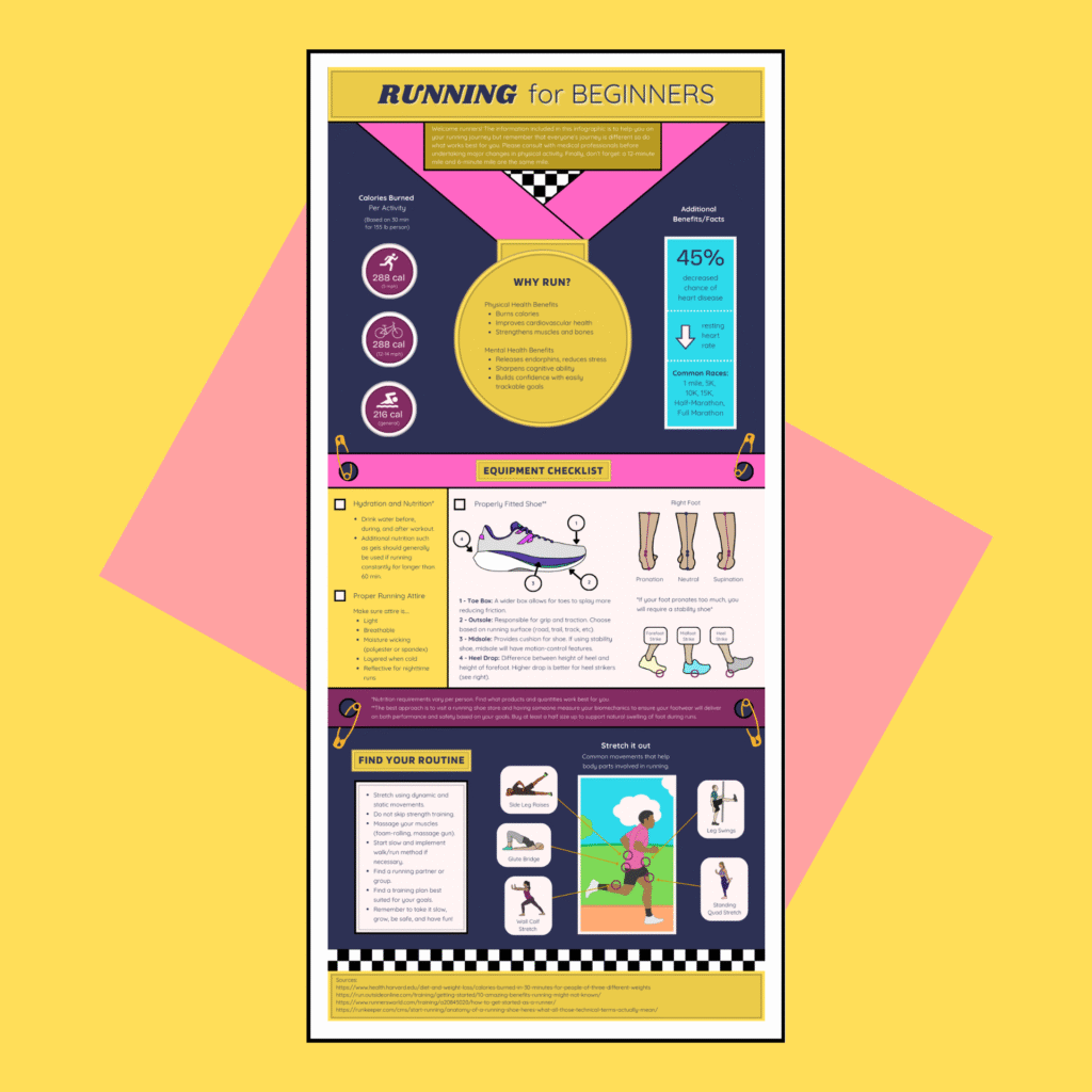
This infographic introduces readers to the fundamentals of running, including its key benefits and essential preparation tips. The goal is not only to inform readers about running, but also to inspire them to begin or continue their own running journey. I developed this poster for my Instructional Development and Production course at Indiana University.
I based my research for this project in personal experiences with running and online sources such running shoe brand websites, running blogs, and medical journals. To support the design itself, I also looked at various infographic examples.
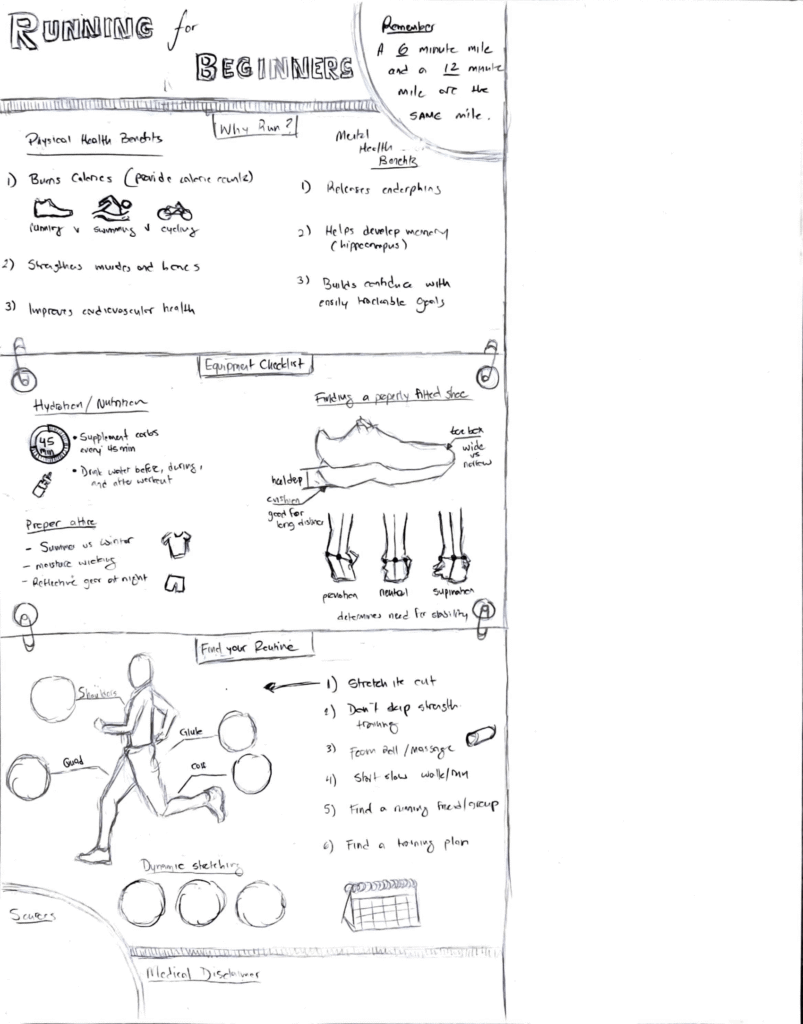
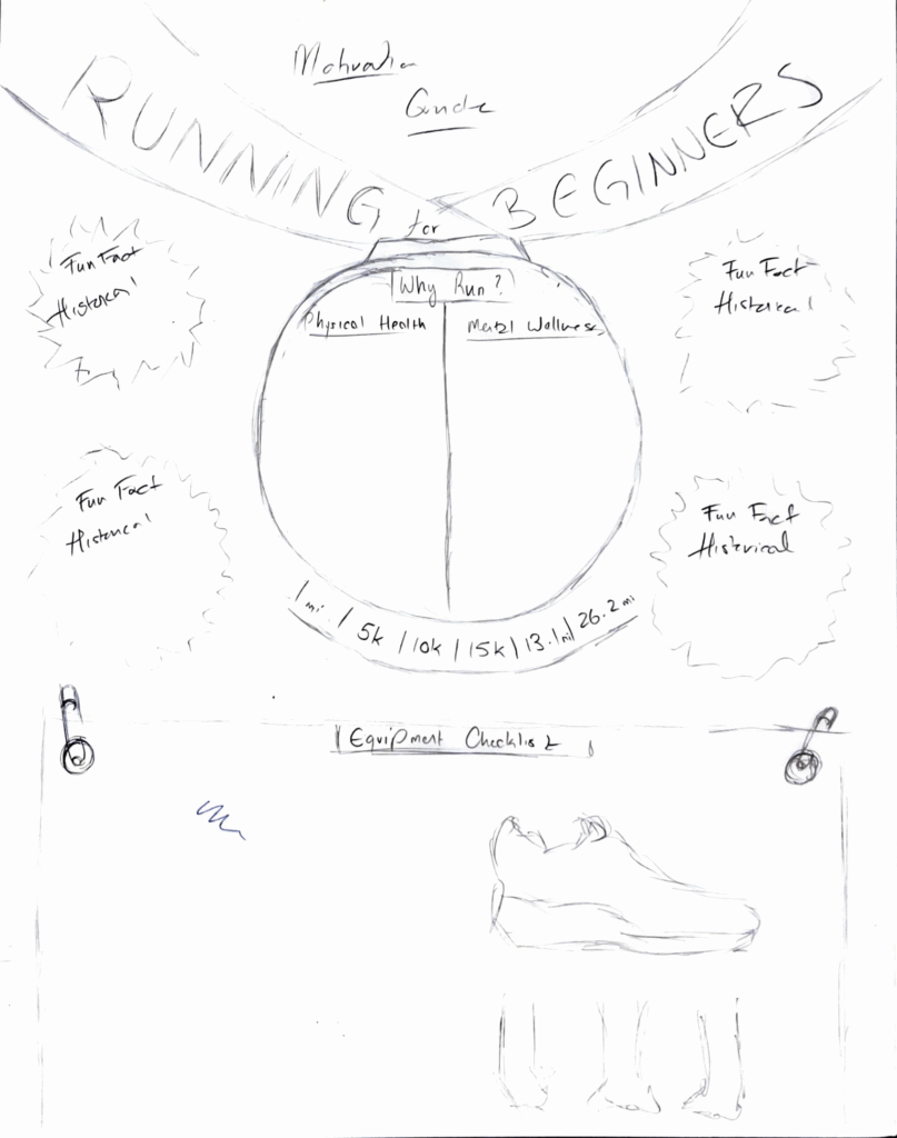
To better understand the overall content and layout, I began by creating preliminary sketches. My first sketch was horizontal, but I wanted the poster’s format to better reflect the running theme more directly. Due to this, I changed the orientation to vertical and incorporated a race bib. To reinforce the concept even further, I added a medal shape, allowing the poster to resemble a runner’s entire torso after a race.
Creating the Graphics
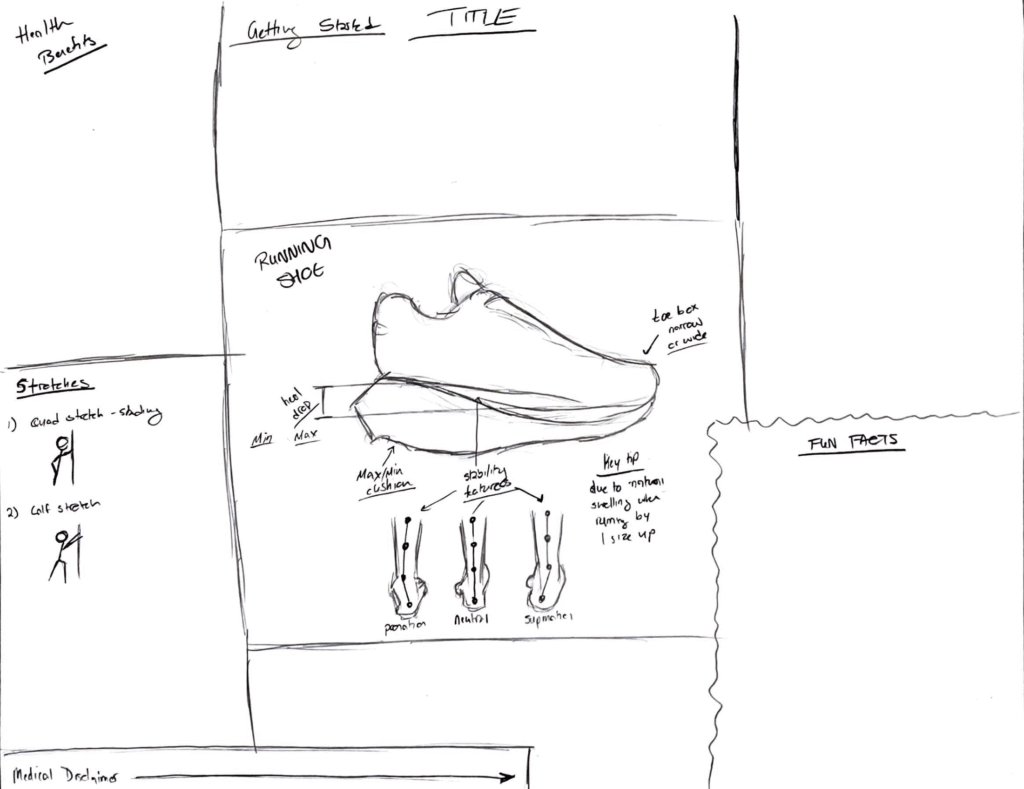
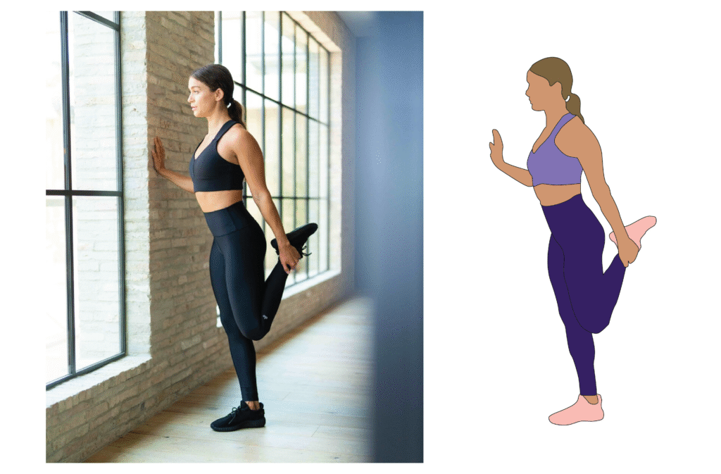
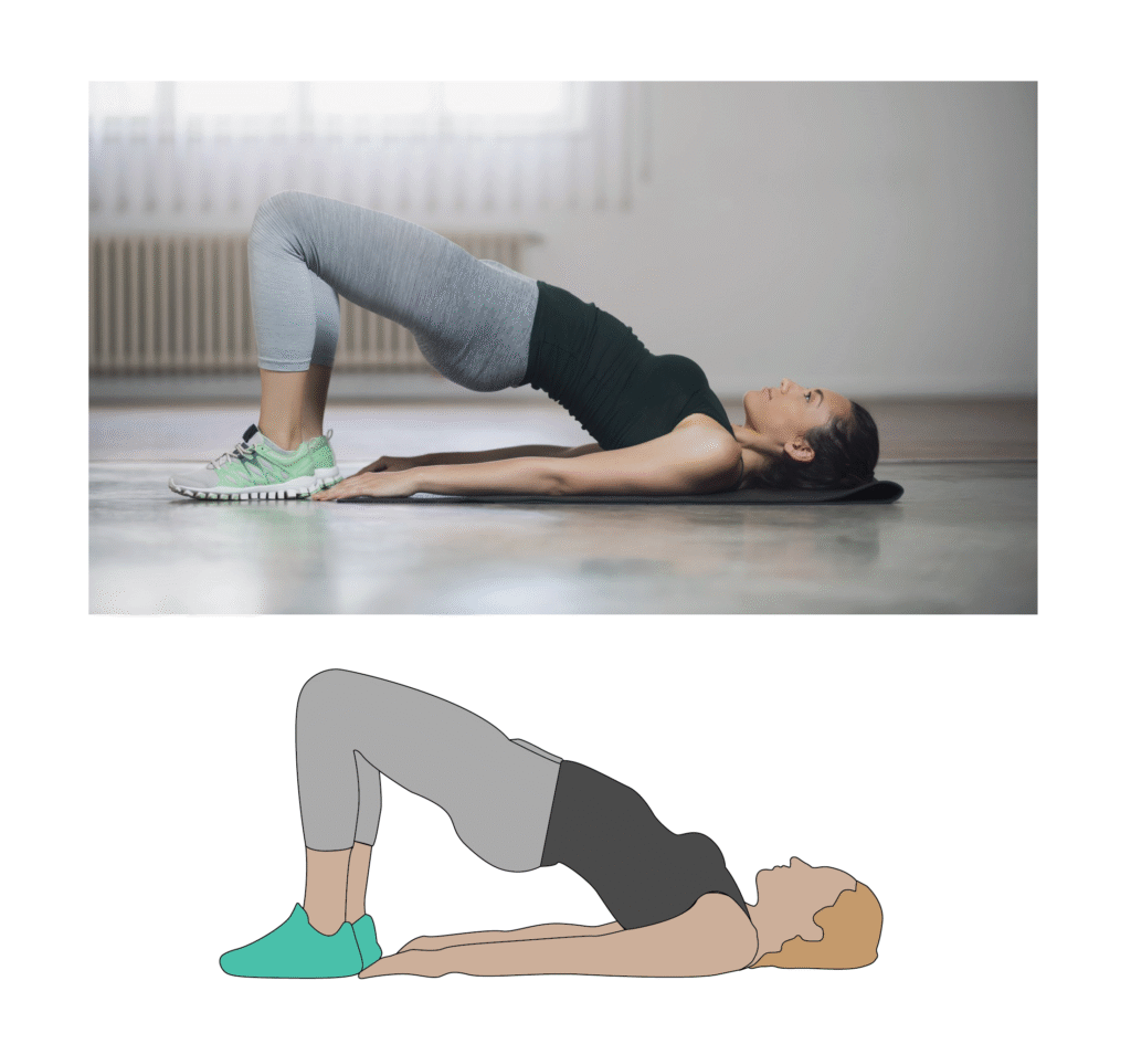
My next step was to create the individual graphics in Adobe Illustrator. I digitally traced the smaller graphics, such as the foot placement directly from my preliminary sketches. For the more complex ones, I used reference images, placing them into Illustrator and tracing them with the Pen tool before using the Fill tool to color them in. I knew the stretching graphics would appear small and needed to emphasize overall body form rather than fine detail, therefore I intentionally avoided adding unnecessary detail such as eyes, mouths, ears, etc.
Creating the Final Design
I created the final infographic using Canva. The final product ended up being a combination of the second and third preliminary sketches. During this stage, I implemented various impromptu design decisions to enhance the running theme such as the checkered pattern at the beginning and end and the perforated rectangle representing post-race food and drink tickets.
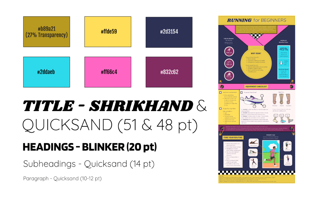
I inspired the color scheme of this infographic from my first pair of running shoes: the Saucony Triumph 20s Prospect/Glass color wave. This was the first decision I made because I wanted to include a personal touch to the final product. My goal with the fonts was to maximize readability. One critical and specific decision I made was including the italicized Shrikhand font to the title to create horizontal movement further incorporating the running theme.