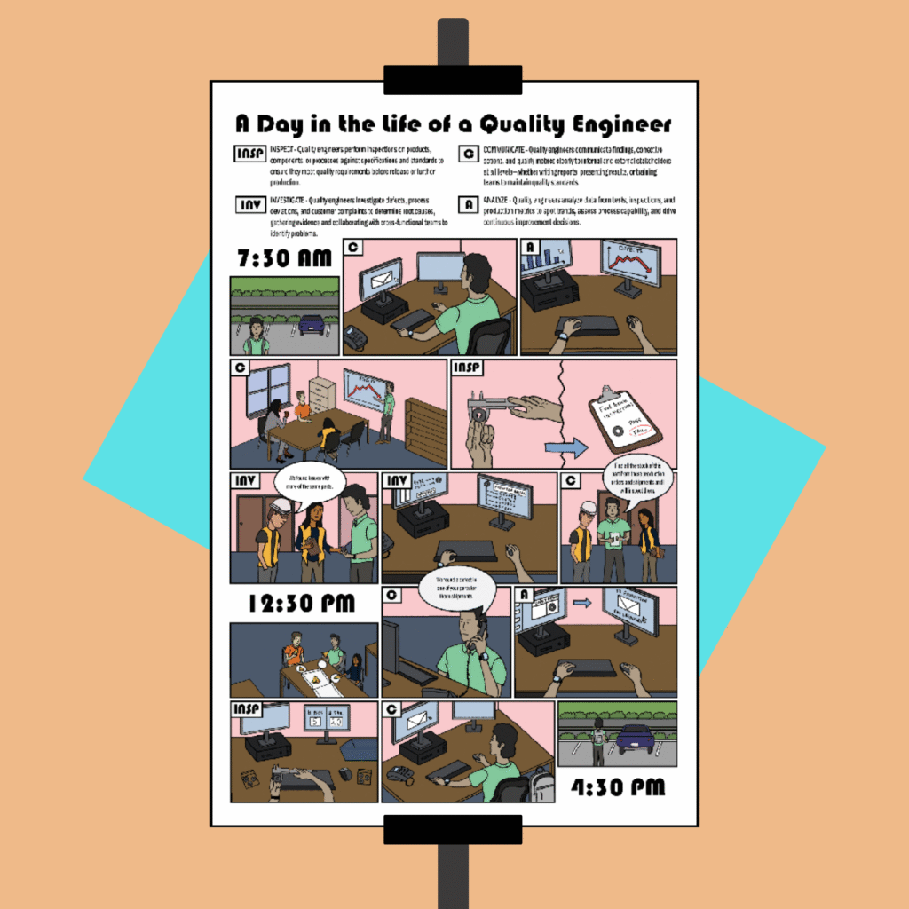
I created this comic book–style poster to visually support recruiters in authentically showcasing the role of a Quality Engineer. Ideal for career fairs, job expos, or as an eye-catching addition to job postings, this poster helps candidates connect with the position. I completed this project for my Instructional Graphics Design course at Indiana University.
The general idea of this poster is for it to be customizable to the job it demonstrates. This particular version aims to give candidates a realistic look into the life of a quality engineer; however, it can be made for any position. Organizations can customize it further by illustrating their own workspace. To support this specific poster, I drew on my prior experience both as a prospective job applicant and as a quality engineer. I also conducted a review of current quality engineering job postings on LinkedIn to gain insight into the expectations and requirements employers are prioritizing today.
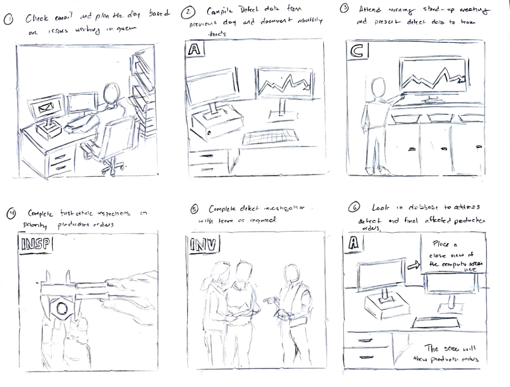
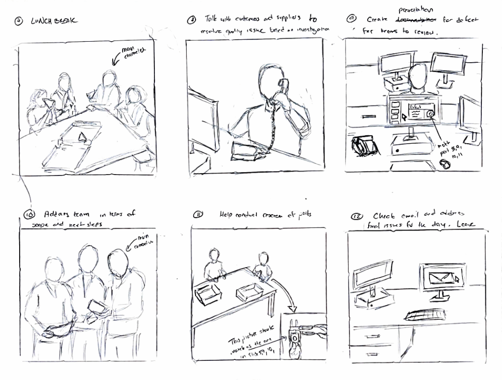
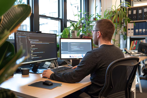
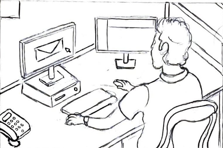
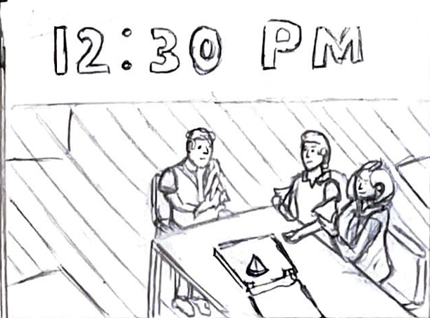
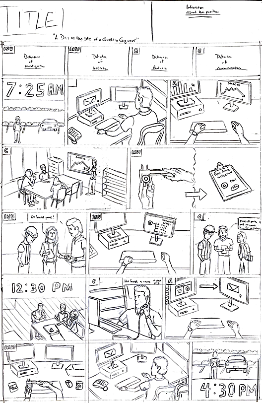
To gain a clear understanding of the poster’s structure, I began by developing a detailed storyboard that outlined both the visuals and accompanying text. I started by listing key responsibilities of the role and grouped them into four core categories: Inspect, Investigate, Analyze, and Communicate. Then, I arranged the responsibilities in chronological order to reflect the natural flow of a typical workday. I used stock images as visual references to maintain accuracy and consistency. Many of the visual elements were inspired by my own experiences. For example, the desk featured in the poster is modeled after the one I sat at during my Quality Engineering internship in 2022.
Creating a Layout
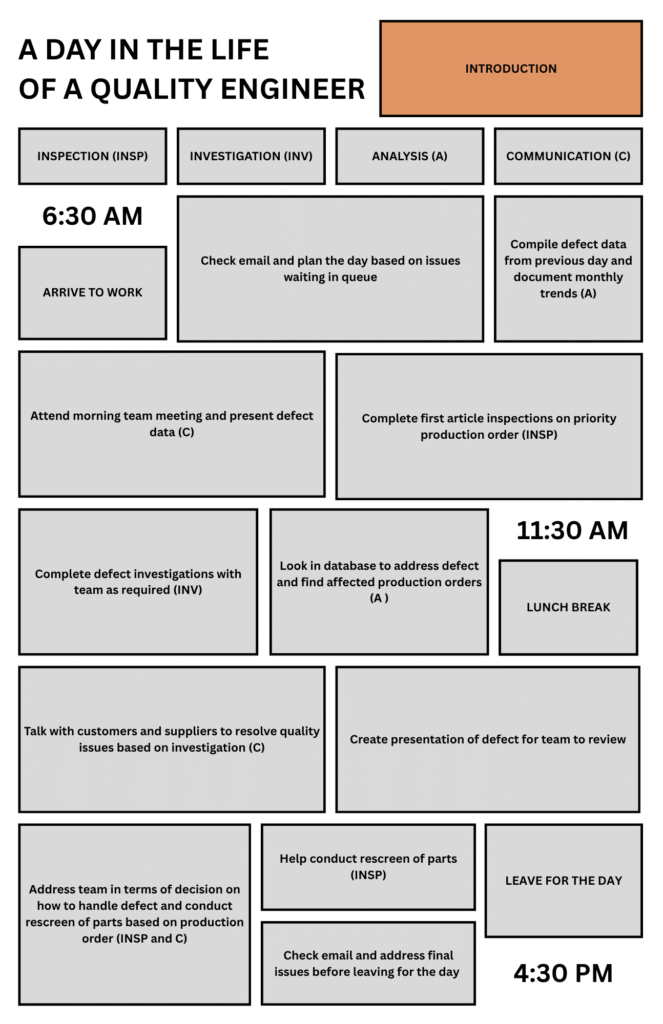
Once the storyboard was finalized, I moved on to laying out the content within the required 11×17 poster dimensions. I used Canva for this step because its intuitive interface made it easy to create and align shapes and text with precision.
The biggest challenge during this phase was balancing space allocation to reflect the weight of each responsibility. I gave tasks that are more time-intensive and central to the role such as team meetings, investigations, and preparing presentation greater visual emphasis. In contrast, I allocated less space to routine actions like arriving and leaving work.
Designing the Characters
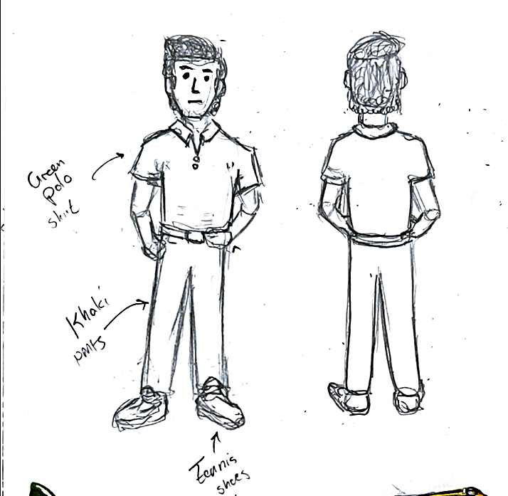
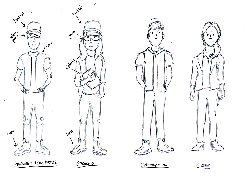
Next, I designed the following characters: the quality engineer (main character), a production team member, two manufacturing engineers, and the manager. These characters were chosen because they are the positions that a quality engineer interacts with most frequently. When designing, I focused on providing each character with features that would help the viewer recognize their role. For example, the manager is wearing a suit, while the production team member is in full protective equipment. I did this to maximize the visual aspect of the poster so I could minimize text thus reducing the amount of reading required by the viewer.
Creating the First Draft
Next, I combined the character designs with the storyboard and the layout to create the first draft on a piece of 11×17 poster paper. To help with a few of the visuals, I continued to utilize reference images.
Creating the Final Poster
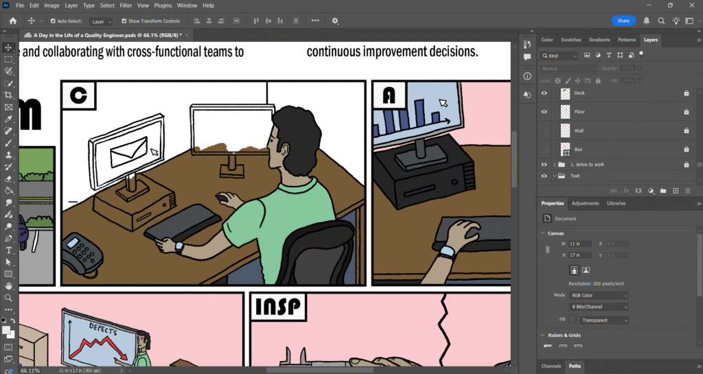
For the final step, I placed the first draft into Adobe Photoshop and used the Pen and Brush tool to create the outlines and color respectively. To organize my work, I created grouped layers for each box, the descriptions, and speech bubbles. Within each box group, I created individual layers for each person and object.
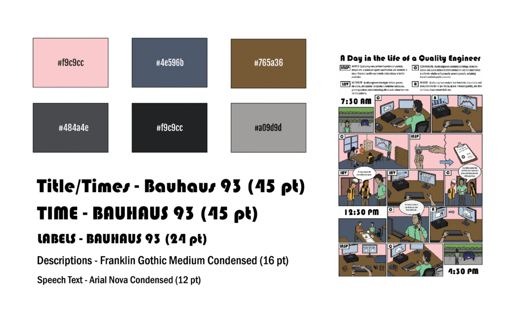
The color palette for this poster was inspired by the visual style of previous offices I’ve worked in. The primary change I made was using a soft red tone for the walls. Rather than defaulting to a common wall color like white or beige, I wanted to introduce more color to reduce empty white space and create a sense of consistency. For the title, labels, and time markers, I selected Bauhaus 93 to achieve a thicker, more prominent typeface presence. To enhance contrast and readability, I paired this with two sans serif fonts for the body descriptions and speech bubbles.