How to Use Calipers
I created this instructional manual to train readers on how to use various types of calipers including vernier, digital, and dial calipers. The manual is intended for print publication and serves as a resource to be used within a manufacturing organization. I completed this project for my Instructional Graphics Design course at Indiana University. Click the buttons below to view the final product.
Audience: Engineers, Production Workers, Quality Inspectors
Responsibilities: Instructional Design, Graphic Design, Print Publication
Tools Used: Adobe InDesign and Illustrator
Storyboarding
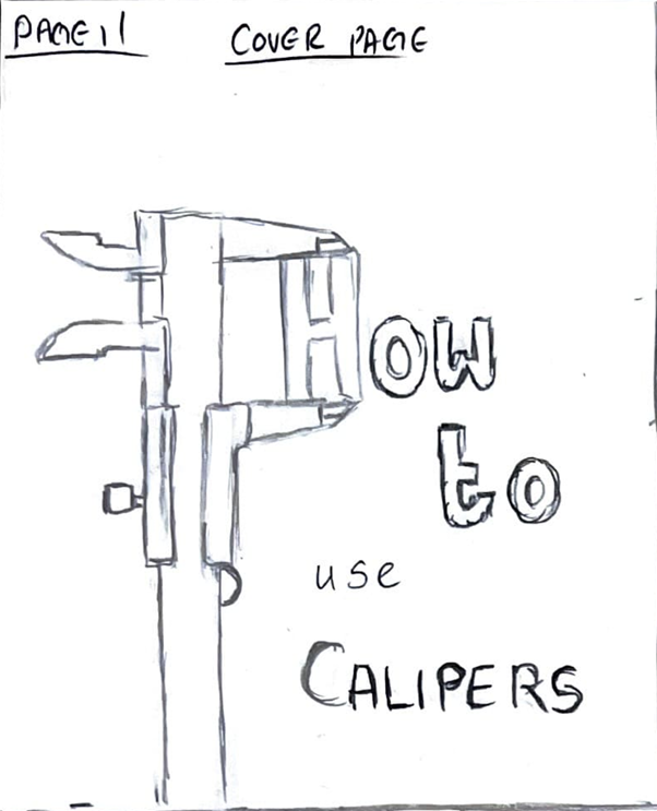
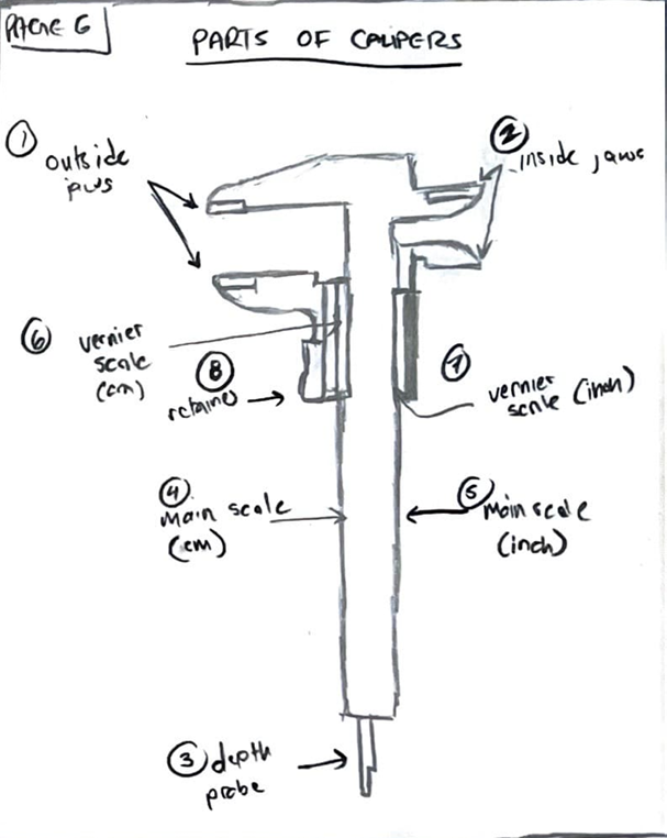
My research for this project was based in my previous experiences in quality engineering. I also conducted online research for more information specifically on proper maintenance of calipers. To get a better understanding of the overall content and structure, I first built a storyboard that detailed both visuals and text. Click the button to the right to see the full storyboard.
Creating the Graphics
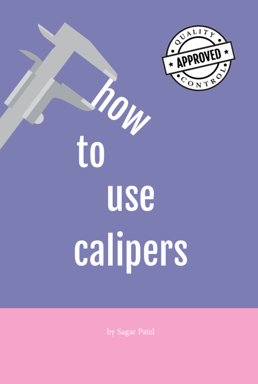
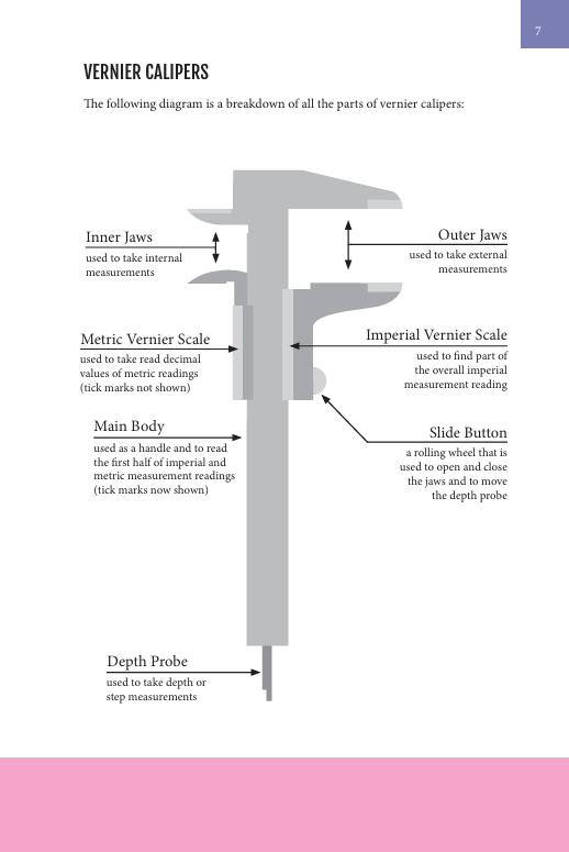
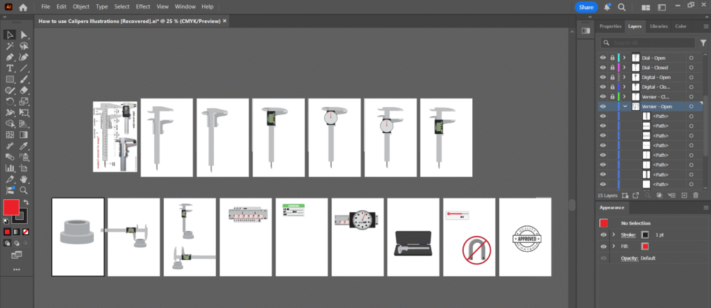
I created all the graphics using Adobe Illustrator. To help with the illustrations of the calipers, I utilized a reference image that I traced using the Pen Tool. To easily customize the calipers from the open to closed position, I made each graphic using individual shapes that represented the parts.
Creating the Final Manual
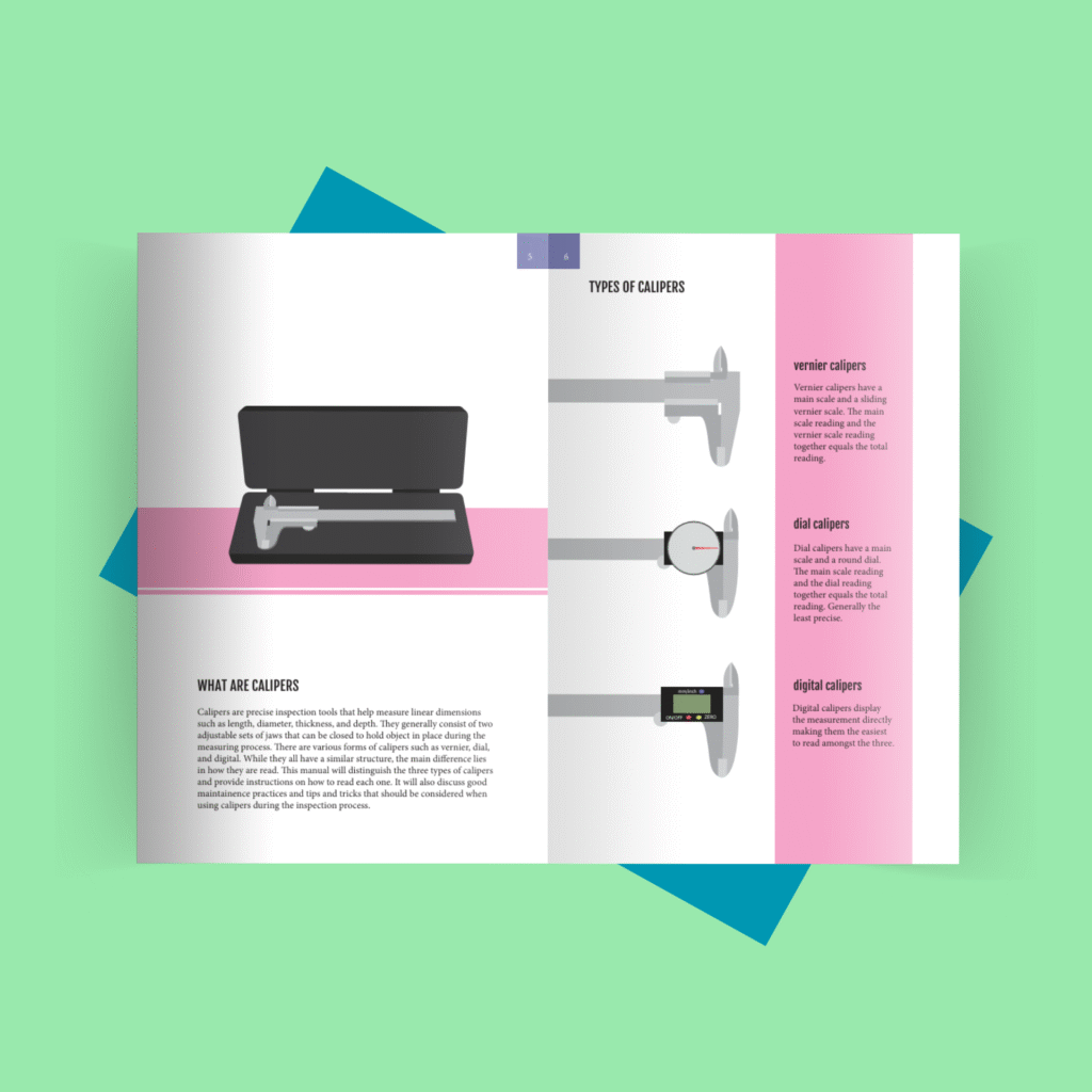
Once the graphics were created, I set up the manual in Adobe InDesign and started to format based on the original storyboard. I made multiple design revisions during this step such as incorporating the pink and blue blocks to create a theme. I also added more information to certain sections, thus creating more graphics. To ensure all my changes were updated, I embedded the graphic links directly from Illustrator so that they would update as I updated the Illustrator document. Since I printed the manual through Barnes and Noble, I utilized their print formatting requirements when setting up the document.
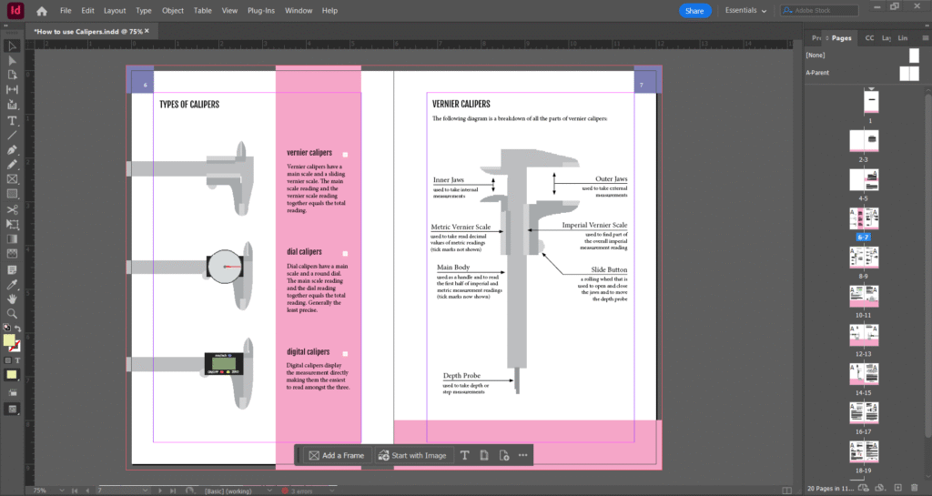
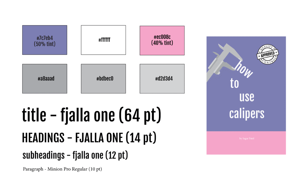
I selected Fjalla One for the title and headers because its strong, geometric structure aligns with the core purpose of calipers—measuring geometric components. To create a clear visual contrast between the headers and the body text, I paired it with Minion Pro Regular, a serif typeface that offers readability and balance. I decided on the pink and blue colors to achieve a modern look and because they paired well with the multiple greys that had to be used for the caliper graphics.
